Have you ever wanted to recreate your LinkedIn profile header? Let’s take a look at the steps involved in this user interface.
Welcome to the January XAML Festival! This article guides you through creating a LinkedIn profile header, using a Microsoft profile as an example.
We’ll look at a variety of tips and techniques, such as overlapping controls, using borders, leveraging the .NET MAUI Community Toolkit, and more. Open Visual Studio or Visual Studio Code and join the creative journey of bringing this UI to life! 💪
January’s XAML Fest is a month-long initiative showcasing various iterations of iconic user interfaces. If you would like to learn more about this exciting journey, please visit “Welcome to January’s XAML Fest for .NET MAUI.” Please check out the article.
For comprehensive understanding, here is an overview of the topics that make up the article description:
- Tips to maximize your learning experience
- Understanding UI Structure
- Main layout settings
- Develop each step in detail
✍️ Tips to maximize your learning experience
Before you begin your coding and design journey, it’s important to make sure you’re fully prepared to get the most out of this post. Here are some useful tips to help you improve your experience and increase productivity when recreating your LinkedIn profile header UI:
-
Visual reference of the original UI: To get started, I’ll show you images of the original UI, broken down step by step. Each corresponds to a different aspect of design that we will cover.
-
In-depth design analysis: Each step includes an image that highlights the specific design element we are focusing on. This approach provides a clear, focused examination of each design component.
-
Guided Coding Section: Please pay attention to the following comments in all coding sections: “Insert the code described in the next section here.” These comments act as prompts to insert upcoming code comments at that point, ensuring a smooth and organized coding experience.
With all of these tools at your disposal, you’re now ready to take a look at your UI code. Prepare for an exciting journey that will give you hands-on experience and in-depth knowledge of .NET MAUI, with a particular focus on XAML for graphical interfaces. Let’s start this fun adventure. Happy coding! 🚀🎨🌟
Understanding card structure
Before you start coding, take the time to understand the scope and implications of your project. This initial step involves breaking the design into smaller, manageable parts, each of which is called a “step.” Each step should have an order number, description, and unique color for easy identification. This not only helps with the development process, but also makes this guide easier to follow. Let’s begin!


Main layout settings
Layout is essential for organizing information on the screen. Our design features a variety of elements arranged across multiple rows and columns. To manage this effectively, we will utilize a grid layout. Grids are especially useful for simplifying the control positioning process and improving overall performance.
⚠ If you want to know more about grids, please read this grid article.
<!-- Main layout-->
<Grid RowDefinitions="Auto,Auto,Auto,Auto,Auto,Auto,Auto"
ColumnDefinitions="*,Auto">

    <!--Insert the code corresponding to Step 1's explanation here.-- >
    <!--Insert the code corresponding to Step 2's explanation here.-- >
    <!--Insert the code corresponding to Step 3's explanation here.-- >

</Grid>
✍️ Upon observation, there are three comments as follows:<!--Insert the code corresponding to the explanation of Step 1 here.-- >” This means that as you go through each step, you will need to insert the corresponding code in the indicated location.
Develop each step in detail 🕵️♂️
Now our structure is in place! 💃 Let’s start creating visuals for each step.
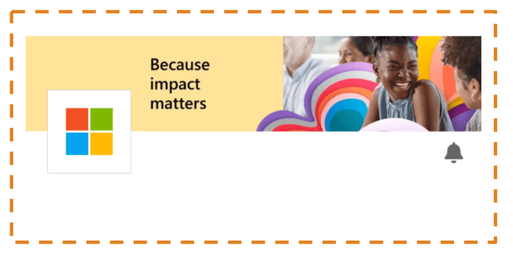
Step 1: Timeline


This step involves adding three different images. Let’s discuss how to include each.
➖ Timeline: This background image extends across the width of the screen.
<!-- Timeline-->
<Image Grid.Row="0" Grid.Column="0" Grid.ColumnSpan="3" Aspect="AspectFill" HeightRequest="90" Source="timeline" VerticalOptions="Start" />

<!-- Insert the code being described in the following section here -->
➖ Profile image: Let’s look at three topics when creating this image:
🔹 border: The image has a colored border, so I’ll put it inside the border.
🔹 Color control based on appearance mode: The border color is determined by whether the device is in light or dark mode (white and black, respectively). To achieve this, we utilize the AppThemeBinding markup extension.
🔹 duplication: In this case, the profile image slightly overlaps the timeline, creating an overlapping effect. To solve this problem you can use the Margin property. You only need to assign a negative value to the top part, as shown below.
<!--Profile image-->
<Border Grid.Row="1" Grid.Column="0" BackgroundColor="{AppThemeBinding Light=White,Dark=Black}" WidthRequest="80" HeightRequest="80" HorizontalOptions="Start" Margin="20,-40,0,0">
    <Image Source="microsoftlogo.jpeg" Margin="2" />
</Border>

<!-- Insert the code being described in the following section here -->
✍️ To understand more about how to handle display modes, please take a look at the article “Handling light and dark modes with .NET MAUI”.
Bell icon: Now, let’s add a bell icon! 🔔
<!-- Bell icon-->

<Image Grid.Row="1" Grid.Column="1" Source="bell" HorizontalOptions="End" HeightRequest="20" Margin="0,0,10,0"/>
<!-- Insert the code being described in the following section here -->
Ultimately, you will get a result like the following image.

Step 2: Description


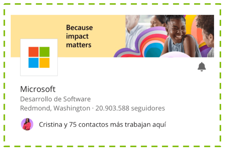
This second block provides the following information:
- profile name
- role
- location
- Round photo of mutual friends
- mutual friend description
Let’s start by adding the first three.
<!-- Profile Name -->
<Label Grid.Row="2" Grid.Column="0" Grid.ColumnSpan="2" Text="Microsoft" Margin="20,15,20,0" FontSize="17"/>

<!-- Description-->
<Label Grid.Row="3" Grid.Column="0" Grid.ColumnSpan="2" Text="Desarrollo de Software" Margin="20,0" FontSize="14" TextColor="{StaticResource GrayPrimary}"/>

<!-- Location-->
<Label Grid.Row="4" Grid.Column="0" Grid.ColumnSpan="2" Text="Redmond, Washington · 20.903.588 seguidores" Margin="20,0,20,10" FontSize="14" TextColor="{StaticResource GrayPrimary}"/>

<!-- Insert the code being described in the following section here -->
Let’s continue looking at round images.
We will display the image using AvatarView from the .NET MAUI Community Toolkit. To implement this, you need to apply the following steps:
One. installation: Add the Community.Toolkit.Maui NuGet package.


2. Setting in MauiProgram.cs: After adding the NuGet package, navigate to MauiProgram.cs. right below UseMauiApp<App>()addition:
.UseMauiCommunityToolkit()
three. Add namespace: Include the Toolkit namespace in your page.
xmlns:toolkit="[http://schemas.microsoft.com/dotnet/2022/maui/toolkit](http://schemas.microsoft.com/dotnet/2022/maui/toolkit)"
4. Using AvatarView: You can now integrate AvatarView into your XAML.
<!--Avatar & description-->
<toolkit:AvatarView Grid.Row="5" Grid.Column="0"
ImageSource="cristina"
BorderColor="Transparent"
HorizontalOptions="Start"
Margin="20,0,10,0"
HeightRequest="30"
WidthRequest="30" />

<!-- Insert the code being described in the following section here -->
Next, let’s add a mutual friend description.
<!-- Mutual Friend description-->
<Label Grid.Row="5" Grid.Column="0" Margin="60,0,0,0" VerticalTextAlignment="Center" Grid.ColumnSpan="2" HorizontalTextAlignment="Start" Text="Cristina y 75 contactos más trabajan aquí"/>

<!-- Insert the code being described in the following section here -->
Ultimately, you will get a result like the following image.

Step 3: Action Button


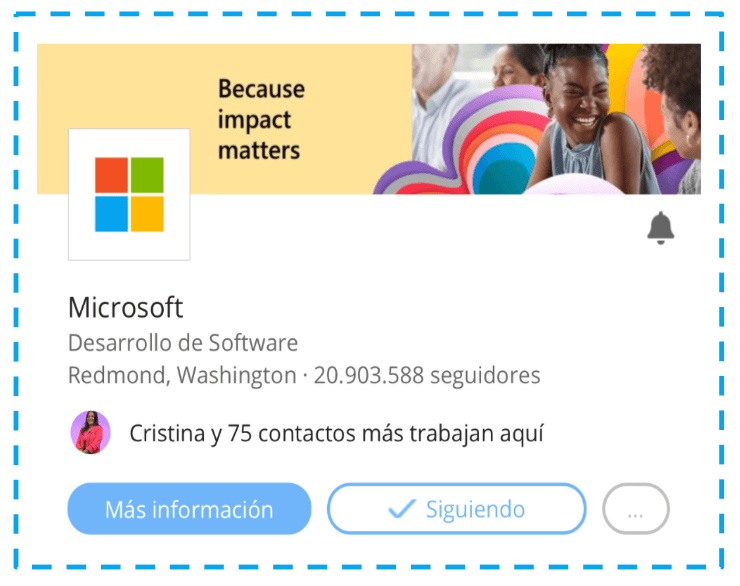
We are in the final stages! The UI is almost complete. This time we will add three buttons. 🎉 Instead of adding directly to the default grid, let’s create another grid and place it inside it. But why? 🤔 This approach allows you to better manage your button height. 😍
<Grid ColumnDefinitions="*,*,Auto"
HeightRequest="50"
Grid.Row="6" Grid.Column="0" Grid.ColumnSpan="2">

    <Button Grid.Column="0" Margin="20,15,0,0" Text="Más información" CornerRadius="15" TextColor="{AppThemeBinding Light=White, Dark=Black}" BackgroundColor="{StaticResource BluePrimary}" Padding="10,-50"/>

    <Button Grid.Column="1" Margin="10,15,0,0" Text="Siguiendo" ImageSource="check" TextColor="{StaticResource BluePrimary}" CornerRadius="15" BackgroundColor="Transparent" BorderWidth="2" BorderColor="{StaticResource BluePrimary}" />

    <Button Grid.Column="2" Margin="10,15,20,0" Text="..." TextColor="Silver" BorderColor="Silver" BorderWidth="2" BackgroundColor="Transparent" CornerRadius="16" />

</Grid>
Ultimately, you will get a result like the following image.

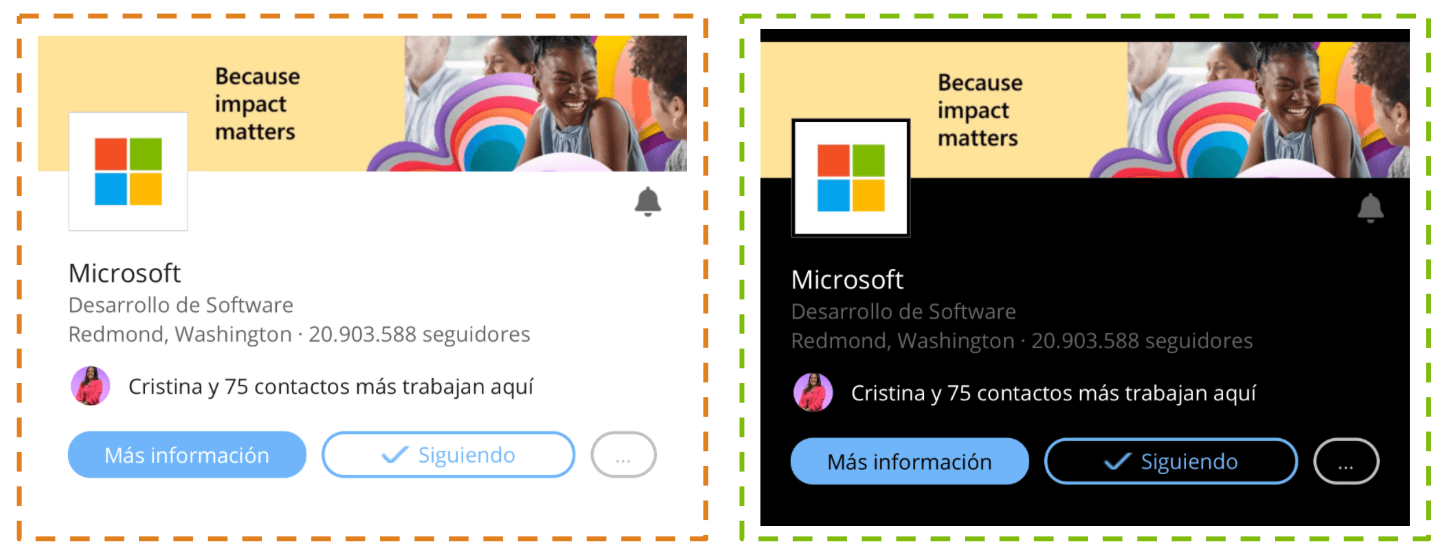
🎉 That’s it! We have successfully created this beautiful UI! 🖥️ But our journey doesn’t end here. We put extra effort into making sure the design looks great in both light and dark modes (which is why the AppThemeBinding markup extension is done in multiple stages). 🌞🌚
Below you’ll see how the UI adapts appropriately to these different settings, demonstrating our commitment to diversity and user experience. Take a look and see for yourself! 🌟🙌

And Microsoft’s LinkedIn header design is done!
Thanks for reading! 👋 See you next time! 💚💕


