Today, we’ll examine five practical ecommerce features that shoppers will be looking for as they shop online in the year ahead.
In ecommerce, the goals are always the same: Attract new shoppers. Maximize sales. Increase customer retention.
What does change, however, is the ecommerce shopper and their needs. Take a look back at the year 2020, for instance. You’ll see how the circumstances surrounding commerce had a huge impact on the features and functionality we used when building online stores.
If you want to stay on top of ecommerce trends, it’s not enough to focus on UI design trends or hi-tech functionality that the top 1% of ecommerce brands and their shoppers benefit from. While you should be aware of hot new trends, it’s more important to focus on how the world is changing the general consumer and, by proxy, their shopping habits.
So, in this post, we’ll be looking at practical ecommerce features that we’re going to see more of in 2024.
5 Ecommerce Features to Embrace in 2024
There’s nothing wrong with playing into superficial UI or UX trends in ecommerce design. If you want to keep your digital products looking and feeling modern, then it’s important to adapt.
However, practically speaking, it’s the features you build into the products that make or break the shopping experience for consumers. Looking at what’s going on in the world and in commerce now and in the year to come, here are some features that shoppers will be craving.
1. Loyalty Programs
With inflation remaining high around the world, consumers are looking for ways to keep expenses low while being able to buy the things they need as well as want. Ecommerce loyalty programs are likely to offer some relief.
A 2022 report from PYMNTS looked into the relationship between consumers and brands. Specifically, the focus was on how loyalty programs, subscriptions and memberships impacted those relationships.
When survey respondents were asked what sort of benefits they currently enjoy and prefer from their loyalty programs, here’s how they ranked them:
- Discounts or deals (52.3%)
- Free products (15.5%)
- Free shipping (13.2%)
These top benefits all offer some form of cost-cutting to the customer. So if you’re building a new ecommerce product and want to appeal to budget-conscious shoppers today, this is a great feature to incorporate.
When fleshing out this feature, don’t just focus on the benefits as stated by the shoppers above. While that may work for certain brands, it won’t for others. Take the time to get to know your target users and the benefits that would make them most likely to subscribe and stay subscribed to your program.
For example, these are the benefits I get when shopping with Pet Supermarket:
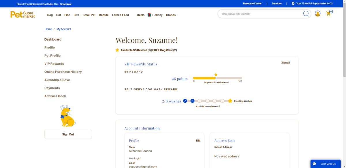

The loyalty program keeps tabs on two aspects of my shopping experience: how much I spend and how many self-serve dog washes I do. The more I shop, the closer I get to cashing in on these rewards.
Another lesson to take away from this example is the design of the loyalty program tracker itself. If you want to encourage customers to keep shopping—even if money is tight—then they should have a crystal-clear view of where they stand with their benefits. It could be the difference between them buying everything they need from your store as opposed to one of those big online marketplaces that offer free shipping, two-day delivery and so on.
2. Subscription Services
Subscriptions are another way to help consumers in 2024 save money while increasing the convenience of buying from a brand.
The PYMNTS survey actually found that subscriptions tend to be more effective in getting customers to spend more than loyalty programs and memberships. Of those surveyed:
- 37% spend more money with brands who offer subscriptions.
- 28% spend more with brands with memberships.
- 27% spend more as loyalty program members.
In addition to bringing in more money to your ecommerce brand, subscriptions help stabilize sales through recurring revenue. So if the company you’re building this ecommerce product for is nervous about inflation as well, subscriptions are a good feature to add to your store. That’s only if it makes sense, of course.
If you’re selling one-time products, a subscription won’t be beneficial to shoppers. The same goes for products that last for a year or more (think of something like pillows or kitchen gadgets). Customers won’t find much value in auto-renewing if they don’t need to get more for a while.
When integrating subscriptions into your shop, it needs to be a seamless experience for customers. Start by demonstrating the perks of a subscription purchase right away. Show them the difference between making a one-time purchase versus setting it up to auto-ship.
For example, this is how the subscription option is advertised on the Beardbrand Barbershop site:
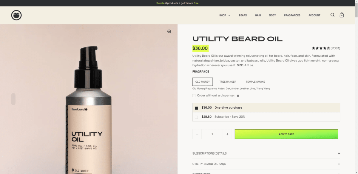

The one-time purchase of $36 contrasts nicely with the subscription price of $28.80, which we’re told saves customers 20%.
Notice also that shoppers have to make the choice to subscribe. The $28.80 subscription price isn’t selected by default (which would leave the site hovering on dark pattern territory).
Once the subscription option is selected, a new condition appears and the customer has to select the frequency at which they want to purchase the product. When they click “Add to Cart,” this serves as their confirmation that they indeed want to sign up for the subscription.
However you offer the subscription discount—on the product page or at checkout—make sure that the terms are clear, the customer has to choose the option, and that it’s easy for them to revert to a regular, one-time purchase.
3. BNPL
Buy Now, Pay Later (BNPL) is a way for customers to finance purchases they can’t pay for in full. So instead of paying a one-time, lump-sum fee, they pay off the purchase over a set period in interest-free installments.
According to data from Motley Fool, there are fewer U.S. shoppers using BNPL this year than in years past:
- In 2021, 56% used BNPL.
- In 2022, 50% did.
- In 2023, only 35% reported using it as of the Motley Fool survey in July.
However, that might have changed after the prime holiday shopping season. According to Bankrate, roughly a quarter of surveyed U.S. shoppers were feeling stressed about the cost of gifts in advance of the 2023 holidays. 10% of them plan to use BNPL to pay for them. (That number is much higher for certain demographics.)
Although BNPL appears to be going in a downward trend, I don’t see it fading away into obscurity any time soon. Plus, with the shaky financial atmosphere, I think BNPL will be a welcome addition to some ecommerce websites and apps.
Take Oura, for example. People might really be excited to try the biometric ring that tracks and delivers insights about their health.
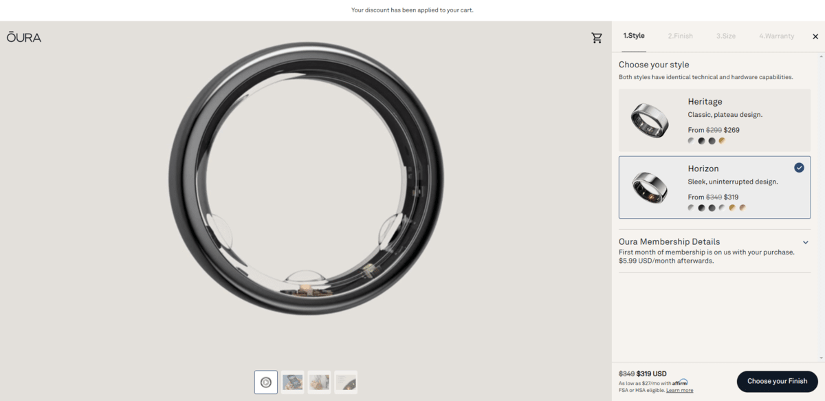

Once they see that the ring’s starting cost is $269 and that there’s a monthly membership fee, they might be hesitant to make that splurge. Especially if they already have health-tracking smartphone apps, smartwatches, etc.
However, Oura lets interested shoppers know at the bottom of the page that financing is available. With Affirm, they’ll only have to pay $27 a month.
Before integrating your shop with BNPL and giving customers the option, really think about if it’s necessary. If you look at that Bankrate article linked above, you’ll see that there are some disparities in terms of which demographics use BNPL.
Millennials, for instance, use it far more frequently than other age groups. Women use it more than men as well. The cost of your products will also dictate if BNPL makes sense as a feature for your online shop.
Take a look at the demographics of your target audience and compare them with the data available on who uses BNPL. Or conduct your own internal surveys and studies to see what you find. Even if BNPL is losing its luster, it might be just what your customers need to keep them shopping.
4. Non-Gated Quizzes
AR and VR have been mentioned in trends lists for years now. I get the reason why. Although ecommerce continues to grow in popularity, shoppers still experience difficulty when choosing the right products to buy. Or they find the right products, but pick the wrong specifications.
Unfortunately, AR and VR tech just isn’t all that practical for a lot of ecommerce companies. We’ve seen brands like Warby Parker use AR to help shoppers try on products, IKEA help customers to choose furniture for their homes, and plenty of real estate companies create 3D tours.
In the last year or so, we’ve also seen big brands like J.Crew and Bloomingdale’s launch virtual stores. However, these are more gimmicks than anything. The UX is slow and buggy in both cases.
While there is some value to using AR and VR to help online shoppers make more confident decisions, there are other ways to accomplish this. Ways that aren’t as expensive or complex for brands big and small to implement.
One thing I’ve been noticing more of is the non-gated quiz. You’ll find an example of this in the top corner of the Bonobos online shop.
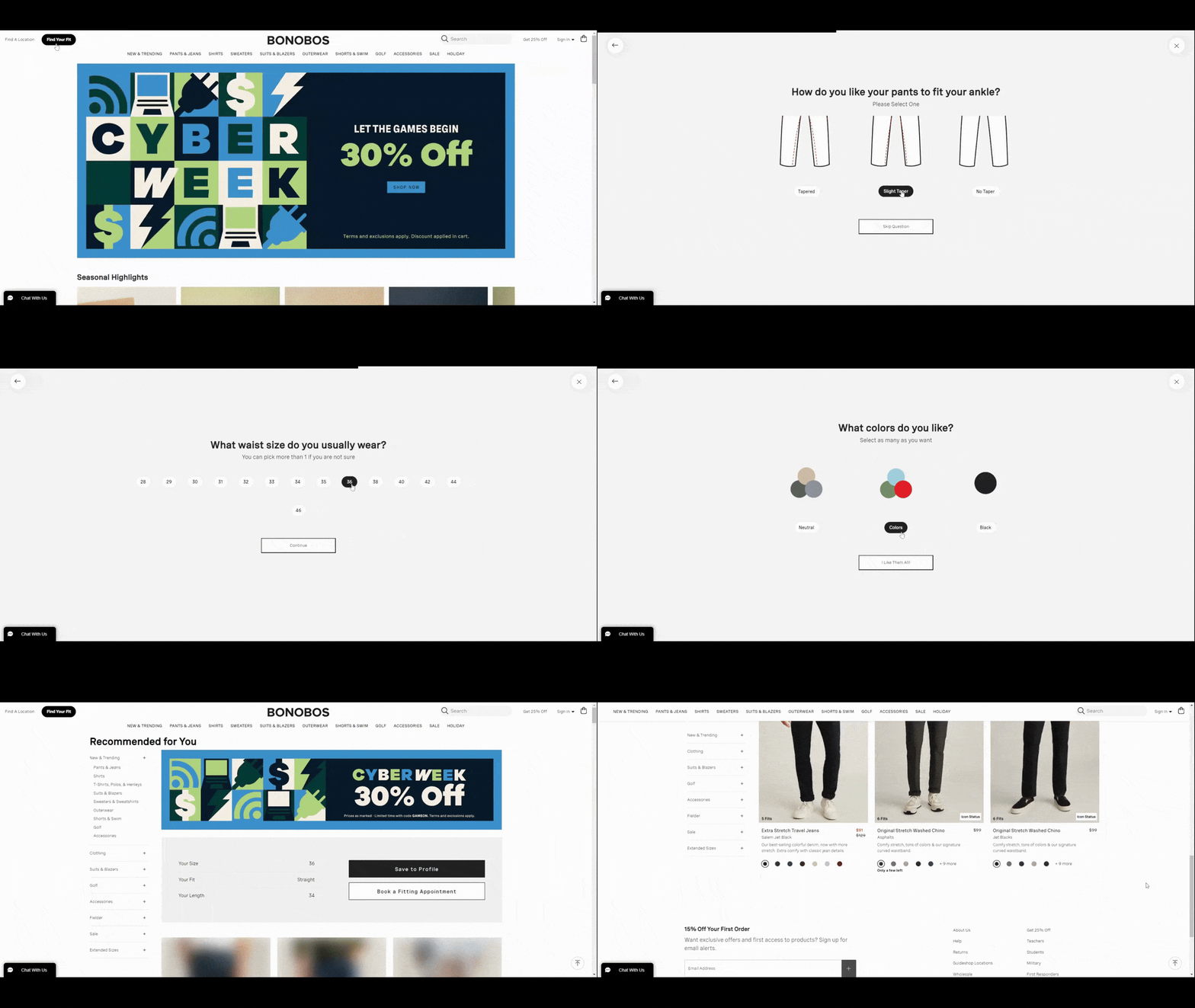

The “Find Your Fit” quiz takes men through the type of fit and taper they prefer as well as the size they currently wear. At the end of the quiz, there’s no pesky email address field keeping them from their recommendations. They’re directed immediately to the products matching their specifications.
That is one thing you have to say about AR and VR product tools. Users aren’t required to hand over their personal information in order to access the features or experiences. That’s not usually the case with product quizzes unfortunately.
However, I think we’re going to see more quizzes like this one. Bonobos uses this quiz to apply the filters that customers would otherwise have to sift through on their own. Quizzes like this can also use real customer insights to provide smarter, more useful recommendations than a bunch of preset filters might.
It’s like adding a helpful sales associate to your ecommerce store. But instead of a real person asking shoppers about what they’re looking for and their preferences, a quiz does the work and then guides the customers to the right section of the store.
5. Sustainable UI
This trend isn’t so much about sustainability as it is about sustainable brands.
If you look at that post I linked to, it mentions how big companies like Coca-Cola and Kimpton have announced more eco-friendly moves to reduce their carbon footprints. That’s not what I’m referring to here. Those brands, no matter how “green” they go, will never change their UIs to appear or even be more eco-friendly.
This particular trend refers to brands whose entire identities are based on offering a clean, eco-conscious alternative to what’s already out there. I think we’re going to see a lot more of these brands in 2024 that have gone all-in on sustainability. And I think their clean, simplistic and authentic approach to web design and UX will have an impact on how other small ecommerce websites are designed.
Take a site like Numi, for example.
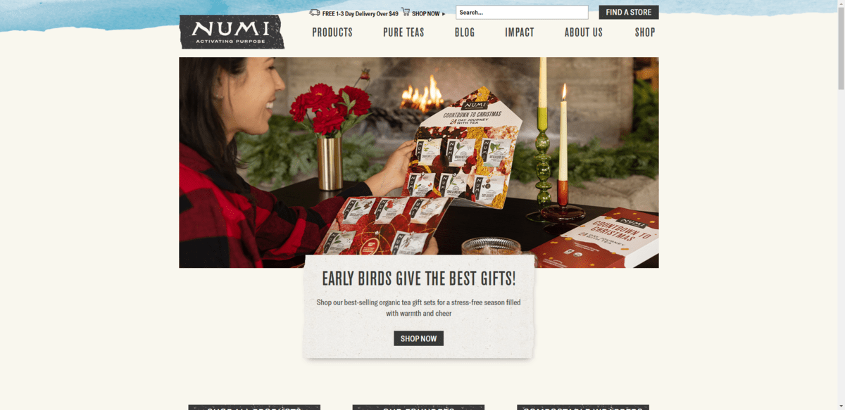

The website doesn’t look like your typical ecommerce website. It doesn’t even look like websites for other fair trade tea companies like Mighty Tea or Stash.
The website feels more natural and warm with its eggshell coloring and hand-painted elements. It also feels a little bit rustic with grainy effects applied to some of the content backgrounds.
If you’ve ever bought an all-natural product before, take a look at the label. Many times it will explain why their packaging or the products themselves look flawed with specks or have uneven colors in them. This same kind of effect has been used on the Numi site.
There is absolutely no doubt that consumers are interested in buying more clean, natural and sustainable products. I think this type of design that draws on raw and realistic qualities from these types of products will help customers more easily find and connect with green brands. And as the number of these companies grows, we’ll see more of the web transformed into this eco-friendly style of UI design.
Wrap-up
Whether you’re building digital products for big ecommerce brands or small startups, you want to stay ahead of the curve. While it’s valuable to know what the coming year’s trends will look like, be cautious about going all in on a new style or technology that might quickly change.
The safer bet is to take a look around at what’s happening in the world and how it’s impacting shoppers as a whole. If you can predict what they need based on that, you’ll be able to more effectively design the right shopping experiences for them in that moment. And, as a consequence, help your clients keep their conversion rates high no matter how in flux things might seem.


